Sales Boost Sections
These are the conversion-focused sections in Vertex — the urgency cues, the promo surfaces, the modal flows, and the bundle blocks. None of them require a third-party app. All of them respect Shopify Theme Store policy (no persistent wishlists, no tracking scripts, no affiliate links).
Stack too many urgency cues and they cancel each other out. A countdown next to a low-stock counter next to a promo popup screams desperate. Pick the one that matches your campaign, lean into it, and rotate.
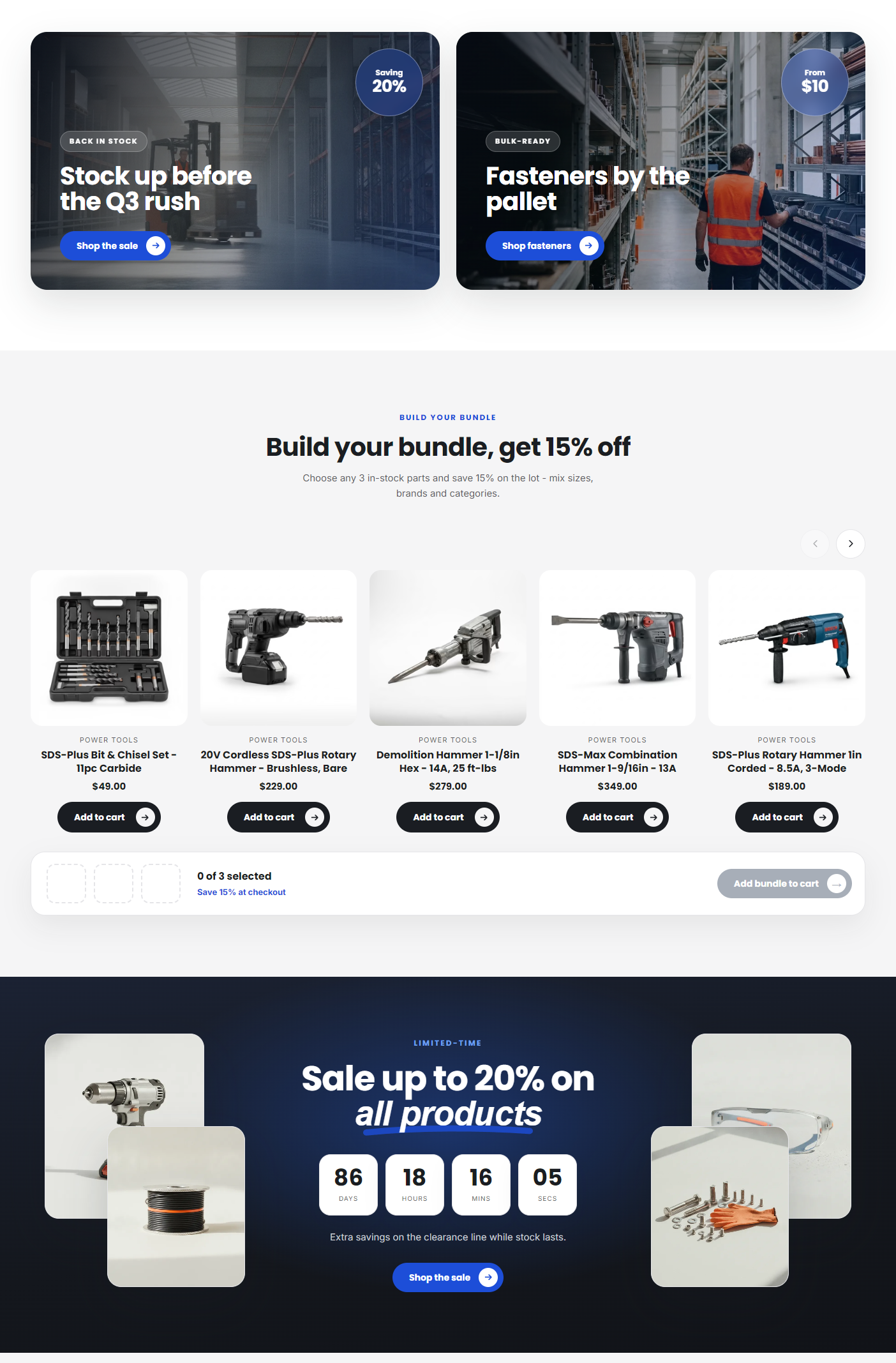
Promo banner
A dismissible top banner — typically used to promote a sitewide sale, free-shipping threshold, or seasonal campaign. Distinct from the announcement bar (which is always-on chrome); the promo banner is campaign-driven and dismissible.
Open Shopify admin → Online Store → Themes → Customize. In the page editor, click Add section and choose Promo banner.
Settings
- Text — Short value message: "Spring Sale · 15% off orders over $1,000".
- Background color — Pick a high-contrast accent — cobalt, red-orange, teal, etc.
- Link URL — Click target for the banner (the entire band is clickable).
- Link label — Inline call-to-action: "Shop the sale →".
- Dismissible — On by default. Adds the close button so visitors can hide the banner.
- Position — Above header (default) or Below header. Above the header reads more urgent; below reads more like a banner.
Dismissibility
When Dismissible is on, clicking the close button hides the banner for that visitor. The banner stays hidden in their browser until they clear their site data — or you re-publish the section under a new ID.
If you want to re-surface a dismissed promo for a new campaign, delete and re-add the section in the customizer. The old hidden state will no longer match and the banner will reappear for everyone.
Promo popup
Auto-opening modal with image, heading, body, and call-to-action button. Pick a trigger and a cooldown so visitors don't see it on every page load.
In the page editor, click Add section and choose Promo popup.
Settings
- Heading — "Subscribe & save 10%" or "Wait — get a free swatch kit".
- Body — Short reassurance plus value proposition.
- Image — Side illustration (or full-bleed background).
- CTA label — "Sign up" or "Get the kit".
- CTA URL — Form page or product.
- Trigger — Immediate (with delay), On scroll (after 50% scrolled), or Exit intent (mouse-leave detection).
- Delay seconds — Only used when the trigger is Immediate. Default 5.
- Cookie expiry days — Default 7. Visitors who close or convert won't see it again for that many days.
Triggers explained
| Trigger | Best for | UX consideration |
|---|---|---|
| Immediate (delay) | Newsletter signups, first-time visitor offers | Most intrusive — use a 5–10 second delay minimum |
| On scroll (50%) | Engagement signal — only fires after the visitor has scrolled, signaling interest | Best balance of conversion and UX |
| Exit intent | Last-chance offers, abandonment recovery | Desktop only — exit-intent doesn't fire reliably on mobile |
The modal won't re-open for a visitor until the cookie expires.
Countdown
Days, hours, minutes, and seconds counter. Live-counting, with the initial state shown the moment the page loads (no flash of empty content).
In the page editor, click Add section and choose Countdown.
Settings
- Heading — "Spring sale ends in".
- End date — Date and time picker for when the timer expires. Stored in your store's timezone.
- Expired text — Replaces the counter once the timer hits zero. "The sale has ended".
- Link URL — Optional call-to-action below the counter.
- Link label — "Shop now".
- Color scheme — Standard color scheme dropdown.
How it counts
The timer updates every second. When the target time is reached, the counter is replaced with the Expired text and the call-to-action link is hidden.
Fake countdowns (perpetually 24 hours, reset on page reload) destroy trust. Tie the End date to a real campaign end and let the section take care of the expiry state.
Featured bundles
Curated bundle cards with image, title, discount badge, and Add to cart button. Each block is one bundle (typically a parent product that bundles 2–5 SKUs, configured as a Shopify Bundle in your admin).
In the page editor, click Add section and choose Featured bundles, then click Add block to add one card per bundle.
Per-block settings
- Product — Pick the bundle parent product.
- Bundle label — Override the product title — "Starter MRO Kit".
- Discount text — Badge overlaid on the image — "Save 15%" / "3 for the price of 2".
- Description — Short value proposition under the title.
Section settings
- Heading — "Bundle & save"
- Columns — 2, 3, or 4
- Show price — Toggle (respects login-required pricing)
Discount badge styling
The discount text shows as a circular pill over the top-right corner of the image. Use accent colors (cobalt, red-orange, teal) — the badge is small enough that it doesn't overwhelm the bundle visual.
Stock counter (low-stock indicator)
This block lives on the product page — see Product Page for full details. It only appears for variants you track inventory on, and switches to the "Only N left" warning once stock reaches the low threshold (10 units). It triggers urgency without revealing exact inventory to competitors.
States:
- More than 10 in stock: "In stock"
- At or below 10: "Only 4 left in stock"
- Back-orderable (zero, set to keep selling): "Back-ordered — ships in 7–10 days"
- Sold out (zero, not back-orderable): "Sold out"
Quick view modal
Triggered by the Quick view button on product cards. Opens a modal with the product gallery, variant picker, quantity input, and Add to cart — without leaving the collection page.
What appears in the modal
- Multi-image gallery (with swipe on mobile)
- Title and price (respects login-required pricing and B2B catalog price)
- Variant picker
- Quantity input (with MOQ, max, and case-pack enforcement)
- Add to cart button
- "View full details →" link to the product page
Settings (on product card / collection sections)
- Show quick view button — Toggle (per section: Featured collection, Collection list, search results, related products)
- Quick view button label — Defaults to "Quick view"
When to turn it on or off
| Use case | Recommendation |
|---|---|
| High-volume catalog where buyers compare variants quickly | Turn on — speeds up the "browse 20 products, add 3" flow |
| Highly-technical catalog where buyers need datasheets and specs before deciding | Turn off — quick view doesn't show specs or documents; force the click-through to the product page |
When to use what
| Goal | Section |
|---|---|
| Drive attention to a sitewide campaign | Promo banner |
| Capture email and offer a first-time discount | Promo popup |
| Time-limited offer with hard expiry | Countdown |
| Highlight curated multi-product offers | Featured bundles |
| Urgency on the product page without revealing exact inventory | Stock counter |
| Reduce friction on the collection page to Add to cart flow | Quick view |
What's next
- Product page sections → — Stock counter on the product page in full
- Homepage marketing → — Where to drop promo banners on the homepage
- Finder sections → — Make/Model/Year and Brand/Category/Capacity finders
- Theme settings reference → — Color schemes, layout, and the product-page toggles